Hello, and welcome to Artisans Cooperative’s branding site. This site was created to be a resource for all things branding for the co-op including brand guidelines, downloadable assets and helpful information for anyone creating content for or with the organization.
Table of Contents
Our Mission
A cooperative online social marketplace built by creatives, for creatives. Member-owned, member-run and member-benefiting, we offer a safe platform to curate community, promote our creativity, support artist livelihoods, and interact with our supporters.
About Us
We are a diverse and inclusive network of creatives building a cooperative online social marketplace.
Our membership brings together people of with a vast spectrum of skills, knowledge, experience, passions and abilities.
We follow the 7 cooperative principles in governance and management, which has shown to build resilient companies.
Our Color Story
Our colors are smart yet casual, friendly and professional. They were picked with flexiblility and creativity in mind and represent all of our communities; Artisans, Supporters and Partners. When using our color palette please ensure to implement accessibility practices. Testing all applications for contrast to ensure ADA compliance is of the utmost importance to us. Tints, shades and transparency may be applied to these colors as needed to achieve accessible images and palettes.
Primary Colors
Hex | #0081A7 CMYK | 100,23,0,35
Hex | #00A4AD CMYK | 100, 5, 0, 32
Hex | #EF6C62 CMYK | 0, 55, 59, 6
Secondary Colors
Hex | #FED9B7 CMYK | 0,15,28,0
Hex | #FDFCDC CMYK | 0,0,13,1
Neutral colors
Our neutrals are available to complement our main color palette. Black and white can be used sparingly.
Hex | #292924 CMYK | 0,0,12,84
Hex | #64645A CMYK | 0,0,10,61
Hex | #89897E CMYK | 0,0,8,46
Hex | #BFBFB5 CMYK | 0,0,5,25
Tints & Shades
Tints and shades of our main colors can be used to create accessible brand images when higher contrast is needed.
Hex | #783934 CMYK | 0,52,57,53
Hex | #F6AAA4 CMYK | 0,31,33,4
Hex | #004053 CMYK | 100,23,0,67
Hex | #BFDFE9 CMYK | 18,4,0,9
Hex | #00585D CMYK | 100,5,0,64
Hex | #C0EBEE CMYK | 19,1,0,7
Typography
The Typography choices made for our branding help to convey our artistic values. We are welcoming in a competitive marketplace and professional yet friendly.
Headings MARTEL SANS (Black 900)
Our heading font is Martel Sans (Black 900) and should always be used in Uppercase. When typing all words should be typed out in sentence case and then modified with the Change Case button or coding. This creates the proper styling without affecting accessibility.
a b c d e f g h i j K L
m n o p q r s t u
v w x y z
Sub Headings & Body Copy
Poppins is a geometric font style that is clean, modern and professional. It is versatile and used for both our subheadings and our body copy just by changing the weight of the font. It is important for us to use a highly readable font with style to continue our dedication to accessibility.
Sub Headings Poppins Medium (Bold)
Aa Bb Cc Dd Ee Ff Gg Hh Ii Jj Kk Ll
Mm Nn Oo Pp Qq Rr Ss Tt Uu
Vv Ww Xx Yy Zz
Body Copy Poppins
Aa Bb Cc Dd Ee Ff Gg Hh Ii Jj Kk Ll
Mm Nn Oo Pp Qq Rr Ss Tt Uu
Vv Ww Xx Yy Zz
Available in all Google apps and for download, free of charge, from Google Fonts.
Download Martel Sans from Google Fonts
Download Poppins from Google Fonts
Turn on Poppins in Adobe Fonts (License Required)
Accessibility
Our branding was built with creative flexibility to ensure the ability to follow accessibility guidelines. As a cooperative that prides itself on equity and inclusion accessibility is a top priority.
Text to Background Color Contrast
Based on WACG guidelines AA minimum standards text and images of text need to have a contrast ratio of at least 4.5:1.
Large-scale text (18pt – typically 24px – and larger, or 14pt – typically 18.66px -and larger if bold) can have a minimum contrast ratio of 3:1.
If you are ever unsure check color contrast through WebAIM Contrast Checker Tool.
Below is an example of approved color combinations with our brand colors:
Standard Text Contrast Checked (17px – Minimum Contrast 4.5:1)
Light text on a dark red background.
Light text on a dark blue background.
Light text on a dark green background.
Dark blue on a light background.
Dark green on a light background.
Dark Red on a light background.
Dark text on a peach background.
Dark text on a light blue background.
Dark on a light green background.
Dark text on red background.
Dark text on a light yellow background.
Dark text on a light green background.
Large Text Contrast Checked (20px Bold – Minimum Contrast 3:1)
Light text on a coral background.
Light text on a green background.
Light text on a blue background.
Red on a light background.
Blue on a light background.
Green on a light background.
Additional accessibilities guidelines live in our Editorial Guidelines here.
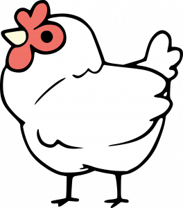
Artisans Cooperative Logo
We were inspired to create our logo from the commonality between the words “coop” and “co-op.” Our Artisan Chick represents the diversity, range, and quirkiness of our artisans and their communities.
Wordmark Logo
Our Wordmark logo comes in two variations. One as a plain wordmark and one with our Icon. When our chicken branding is used within the material our main wordmark may be used without the icon to create balanced branding and show our professionalism.

When no other chicken branding is used within the material the wordmark with our icon may be used to bring a playful element to the materials.
These logos are interchangeable with our Emblem Logo and can be used anytime if the circle format of the Emblem Logo does not fit the design.
Emblem Logo
This logo may be used when our mascot and name need representation together. Branded graphics that may not have our name on the materials or other places where our name is not also mentioned.
Mascot Logo
Our Mascot Logo may be used in a variety of ways to add playful branding where needed. We have it as an Emoji in our Discord Channel and it shows our casual and friendly side.

Icon Logo
Our Icon Logo may be used in places where our wordmark or secondary logo isn’t needed. Especially in circumstances where our brand name is already displayed in the materials. Example: Our Icon may be used as a Social Media profile photo as our brands name would be displayed directly next to it in on our profiles page.
Logo Usage
When displayed on a white or neutral light background our Icon Logo may be displayed in color using our blues and teals as background “sky” colors. Our chicken’s coloring should remain unchanged.
Our Emblem Logo and Icon Wordmark Logo may also be displayed in its outline-only format and it should always be displayed at a size where you can easily read the surrounding text. When using the logos outline please select a brand color that provides adequate contrast to the background it is being displayed on.
Editorial Guidelines
Our Editorial Guidelines provide writing guidance when creating editorial content and copy for the Artisans Cooperative. These guidelines will ensure that all official co-op writing is done with the same on-brand spirit.
Core Values
Authenticity
The main purpose of our marketplace is to make sales of authentic handmade goods that support artisan livelihoods.
Compassion
Artisans should be celebrated and treated with the utmost respect. We will keep the artisans’ best interest at the forefront of our decisions.
Trust
We seek to be transparent and honest with all who come to our marketplace. Trust cannot be built with words alone. We will regularly reach out to our community and incorporate community feedback in our democratic decision-making.
Diversity
We actively seek input from all backgrounds. Diversity is crucial to our success, because it is how we continue to learn and grow as an organization.
Positivity
We want to be the flashlight illuminating a dark path. We can recognize injustice while also providing a way to be successful despite it.
Impact
We are motivated to provide a fair and empowering alternative that enables artisans to achieve financial independence and security.
Personas
Artisans Cooperative Personality
When writing as the Artisans Cooperative, or on its behalf, try to embody the following qualities in your writing:
Confident
We are confident in what we can achieve and have a lot of knowledge to offer, but in a way that is comfortable and friendly. We would rather plant a seed and let it grow than dig a large hole and insert a fully-grown tree.
Playful
While competent and professional, we also have a deep enjoyment of play. This is shown often in the illustrations of our mascot, Brook the Chicken. We prefer to work in a less-formal environment.
Approachable
We are easy to engage with and are able to seamlessly travel between different groups. There are no “dumb questions” for us and we focus on helping others without making them feel uncomfortable.
Engaged
Our playfulness doesn’t take away from our focus. While we may meander a bit conversationally, we remember to stay on point.
Optimistic
The confidence and drive that keeps us optimistic is contagious to those we interact with. People feel motivated and energized after being around us instead of disenfranchised.
Audience Personas
When writing content or copy, keep the personalities and interests of our audience in mind. Do your best to anticipate their questions and answer them preemptively. Audience Personas are kept in the Marketing Strategy and/or Target Personas.
Brand Voice
The Artisans Cooperative has a professional, casual, and friendly voice. Reading our writing should be like hearing information from a knowledgeable friend.
Avoid jargon, cliches, and idioms
Sometimes our knowledgeable friend knows much more than we do. When explaining things to our audience, it’s important to make sure that the information we provide is usable. It’s also important to keep in mind that we have a global audience; colloquialisms and idioms don’t translate well in tools like Google Translate.
Professional doesn’t mean unapproachable
As a business in a creative industry, it is important to balance professionalism with originality. While our language may err on the side of formality, it doesn’t mean that it’s cold or unapproachable.
Always inclusive
“Seek ways to place the ‘other’ in the center of things … Try not to present the privileged, tech-savvy, wealthy, able-bodied, white, cis-gendered, anglo-centric male experience as ‘standard’ and everything else as ‘other’ or ‘diverse.'” (Beth Dunn).
Learn how to avoid unnecessarily discriminatory language by reading these resources:
- Inclusive Language: How to Use It and Promote It At Your Organization
- A Human Approach to Product Content
- The Conscious Style Guide
Common concerns:
- Use “they/them” pronouns as the default for unknown parties
- Avoid unnecessarily gendered language like “manpower”
- Avoid ableist language such as “hysterical” or “crazy”, or calling someone with disabilities “inspirational”
- Avoid cultural appropriation and microaggressions like the use of words like “tribe” (like-minded people), “pow-wow” (meeting), or “spirit animal”(referring to something you connect with).
Show, don’t tell expertise
The information we provide should add value to our users’ lives, and our expertise should be shown, not told. Cite as much information from reliable external sources as possible and practical.
Edit for readability and translation tools
We aim for writing to be at the 8th-grade reading level. Writing should be simple and straightforward for both readability and to create reliable translations in tools like Google Translate. Simplify sentences. Avoid passive voice. Edit down all writing to its essential meaning. The Hemingway editor is a tool that can help demonstrate how to pare down writing in this way, but should be used with common sense and not as the final say.
Positive tone
If dealing with a negative topic, be sure to focus on the solutions and not the problems.
Incorporate our values
Keep in mind the Core Values of Artisans Cooperative in writing.
Importance of “We”
Make strategic use of “we/us” thereby building a sense of collective ownership and mutualism as a cooperative.
Write to our audience
Keep the Brand Personas in mind and write each piece towards them as if they were an audience in front of you as you give a presentation.
Writing Stylebook
We use the Chicago Manual of Style, with some exceptions noted below. When in doubt, err on the side of formality.
A quick reference guide to notable relevant entries is provided below:
Dimensions
“When writing about height, weight or other dimensions, use figures and spell out words such as feet, miles, etc. Examples: She is 5-foot-3. He wrote with a 2-inch pencil.”
Commas
- In lists, we use the Oxford comma. That is the final comma before the and. It is used to avoid confusion. Example: He bought milk, eggs, cheese, bread, and butter.
- Commas and periods go inside quotations. Reference guide.
Numerals
“When referring to money, use numerals. For cents or amounts of $1 million or more, spell the words cents, million, billion, trillion etc. Examples: $26.52, $100,200, $8 million, 6 cents.”
Exceptions
Names
Use a person’s preferred name (or alias) as it was presented to the writer.
For some, that may be a first and last name. If so, the first time they are mentioned in a story, use both. Through the rest of the piece, we default to first names.
Do not use courtesy titles such as Mr., Mrs., Miss or Ms. unless they are specified by the person, part of a direct quotation, or needed to differentiate between people who have the same last name.
Commonly-used terms and phrases
- Artisan not artist. Artist may be used when in a list of example professions (Example: “Our Artisans include makers, crafters, designers, illustrators, and artists”), but never as a replacement for the word Artisan.
- e-commerce not ecommerce
- cooperative not co-operative
- co-op not coop (in title case: Co-op) when using the generic shortened term for a cooperative and not our chicken-themed nickname, “the Coop”
- Members are Artisans, Supporters, and Staff, and their definitions are in the AC Ownership Model Canvas 2.28.23
Brand Names
Primary and first use
✅ Artisans Cooperative
Secondary use
These names can be used in informal communications or outreach for audiences that are already familiar with Artisans Cooperative:
✅ Artisans Co-op
✅ the Coop
Example: “The Artisans Cooperative helps artisans sell their handmade goods. Everyone is welcome at the Coop!”
✅ artisans.coop
When referencing or writing anything that looks like our website, always use the correct spelling and nomenclature: artisans plural. Be aware that autocorrect may try to turn .coop into .com.
Do not use
🚫 AC
🚫 The A/C
🚫 The Artisans Cooperative
🚫 Artist Cooperative
🚫 art.coop
🚫 artisan.coop