When it came time to develop the branding for The Artisans Cooperative, the working group of organizers approached the project creatively. In this post, we’ll tell the story of how we came up with our branding, including the intriguing chicken theme.
The branding effort was led by Miss Thera of Atypically Artistic, a multi-passionate creative educator, artist, playwright, and neurodiversity advocate, and Ryn Lower of Tired Fox Art, a freelance illustrator and designer.
Visual Elements
The visual elements of the brand were developed first through color. Thera produced several rounds of color palettes that went to a vote before the organizers, until there was a consensus.
The resulting palette runs a spectrum of five hypnotically beautiful colors from deep blue, teal, coral, peach, and parchment. The colors were chosen specifically to be inclusive and accessible, including through a color-blindness test. Thera also selected complimentary fonts that were both available on common computer programs and apps and demonstrated our values.
Together, we produced the following Brand Statement:
The colors, fonts, and other style choices we have made all serve a definitive purpose: to tell others who we are. Our colors are smart yet casual, friendly and professional. The fonts convey artistic values that feel welcoming in a competitive marketplace. All elements of design are rooted in accessibility for all users.
Logo Design (About the Chickens)
Moving forward into the logo design, the team was inspired by the commonality between the words “coop” and “co-op.” What began as a joke quickly turned into a serious discussion about chickens. The organizers were animated by the idea of a visual mascot representing the diversity, range, and quirkiness of artisans.
The more the group discussed chickens, the more appropriate they seemed. Beyond the fun word play, chickens, like art, were observed to be something we all have in common: they are ubiquitous worldwide, rural and urban.
Illustrator Ryn stated, “Whenever I see the word cooperative abbreviated as “coop”, my mind immediately goes to chickens and hen houses. Chickens as a theme for an artisan cooperative may be considered a little silly, but it’s also fun and unique and that’s something I think is vital for a brand to stand out.”
The hustle of chickens resonated with painter and ceramics artist Cori Jacobs of Cori Jacobs Gallery: “Chickens are busy. Have you ever seen them go about their day? They’re just constantly pecking around and hustling.”
Freelance writer Valerie Franklin remarked on the parallel of an artist’s work with the chicken’s eggs in the economic system, “In Orwell’s Animal Farm, the chickens were the first to rebel under the leadership of the pigs, so they could keep their eggs.”
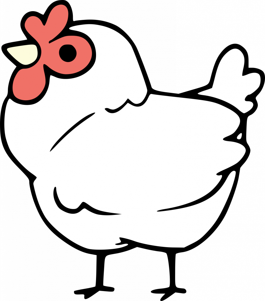
Ryn illustrated the chickens, sharing her vision board as it progressed. The team was excited about using the diversity of chicken breeds, and other fowl, to represent the diversity and inclusiveness we intend for the cooperative: “Everyone belongs in this coop.”
Illustrator Ryn provided this Artist Statement on the chicken illustrations:
Character illustrations are my strength and really what I am best at. I was excited to have the opportunity to make something for the cooperative and chickens were the first thing to come to mind. I can’t recall ever drawing chickens before so at first I was nervous, but the very first sketch I made (bottom right) resonated with me.
To have a good logo, I have only a couple rules. It must be easy to replicate, such that a child could draw it from memory and it should consist only of simple shapes, like circles and hearts. I kept those principles in mind while sketching and I’m happy with the results.
Designer Thera turned the chicken illustrations into the logo and designed the final Branding Kit, which is available here.


Pingback: We're Building A Co-op Marketplace For Artisans Online | Artisans Cooperative
Hi! I appreciate the blog on the logo design but when I see it I still don’t see a chicken! I honestly had no idea what I was looking at for the longest time that I came searching for an explanation on the logo. It looks like human anatomy or something. Almost like the colors are creating an optical illusion. Just trying to provide (very isolated, I know) feedback on a first impression.
Thank you for the feedback! We’re taking it into consideration.
Pingback: Shop The Cooperative Fundraiser | Artisans Cooperative
I have to agree with Shawna – I spent probably half a minute trying to figure out if it was a hand doing the “OK” sign… or some sort of aardvark-bunny made of playdoh.
I do like the chicken co-op/coop theme – it’s just the current logo is so zoomed in it looses it’s chicken-ness. It if showed more of the head and neck it would probably make way more sense. I could only focus on the red part since that was the main symbol and the yellow isn’t a dark enough color to stand out as a beak.
And honestly for clarity of people who are seeing it for the first time the public symbol might be better off being the initials ‘AC’ or ‘ACoop’. Facebook is an ‘f’, Amazon is the ‘a’ with arrow, Patreon is a stylized ‘p’, Netflix is an ‘N’, Mastodon is an ‘m’ with a speechbubble/elephant head, etc etc etc. It helps people remember the actual name when they go to type it into a browser. Open a phone and look at the app icons – most have the initial or name — or an extremely memorable, *established* logo (Starbucks, Paramount). The few newer ones that are just a symbol have the entire field with one meaningful icon: YouTube is a play button, TikTok is a music note, Discord is a game controller…
This all sounds critical but I work in quality assurance so think about this stuff a lot… please know that I am VERY excited about an artisan’s website for actual small businesses / artists and am looking forward to watching y’all grow!
Thank you for the constructive feedback, Kelly! I’m passing this on to our branding team. We’d love to see you get involved! Check out our volunteer interest survey: https://forms.gle/BHX2dSfPwW9GoCa78
Pingback: Our Funding Plan | Artisans Cooperative
What are neuturals?
Typo! Neutrals.
Thanks, but I’m puzzled why neutrals are in your brand colors.
Hey y’all
I think this entire website idea is awesome. Also the logo I instantly saw and understood as a chicken. I’m someone who’s a small handmade artist currently selling on Etsy (which I’m not satisfied with). And as soon as I was shared a link to this website I started looking at the about us page. The explanation of the logo and how it was inspired by the word co-op and the symbolism of the chicken resonates with me. Personally I am tired of logos being super clean and clinical and reduced down to some letters with a color and font. Like the chicken is very inviting. I think that if maybe low vision people can give y’all feedback on what color contrasts or line weight/orientation might help the chicken read more as a chicken for them then that might be something good to take into consideration. But as of right now I love the logo and the idea for this website especially as a small artist operating out of my own home and selling locally who doesn’t want to be connected to big corporations. The chicken warms my heart.